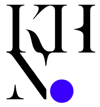
Cognier Technology Group (CTG) is a tech startup that reached out to me in 2018 to re-brand. I was in charge of creating a new logo for the company, as well as several others for various CTG products.
The logo design for CTG, at its core, is about fragmentation. I wanted to create shapes that when looked at, appear disjointed and unrelated but are actually a cohesive whole—all three letters of the company’s acronym: CTG. The curves of the ‘C’ and ‘G’ are the same, so I simply combined the two, with the symmetrical ‘T’ showcased in the middle. This sans serif typeface complements the thicker, sharper, no-nonsense silhouette of the logo; it’s light, airy, and minimal, and it can easily be used in other company designs, as shown above. The colors were chosen with a clean and contemporary yet welcoming mood in mind. In my experience, blue is the most common color for modern companies, especially in the technology sector; dark, industrial blues elicit a professional, serious, and reassuring perception from customers, and more green hues are proven to feel more playful, friendly, and approachable. This reflects Cognier Technology Group’s cutting-edge but pleasant working approach.
The requested turn-around from Thomas Lah, the founder and CEO of Cognier, was a week, but I had it completed within 48 hours, including some revisions based on my client’s feedback. Mr. Lah gave me some basic requirements (i.e. looks “modern” and incorporates the letters “C,” “T,” and “G”) and allowed me the room to work, which I greatly appreciated. However, I still researched the company, reviewing their site, to create a tangible connection to Cognier and their mission.
